lesson plan
Infographics are an increasingly popular way of sharing information or marketing in newspapers, magazines, posters and online. These visual representations of knowledge and information are designed to make complex ideas and large amounts of data easy to understand.
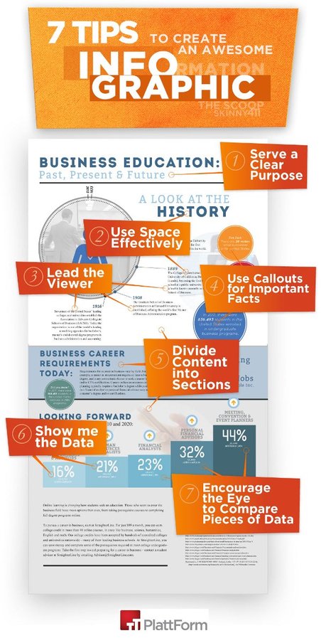
Infographics are also entering the education space in new and exciting ways. What students are “expected to learn” are not facts so much as argumentation, logic and how to vet and interpret information. The goal is to help students distill the most important pieces of information from any given source and form a conclusion. A good graphic can fit these standards by reinforcing to students that their conclusions should be grounded in evidence and by challenging their ability to organize a hierarchy of systems, a.k.a. the ability to tell what pieces of information are the most important. Infographics can also offer a rare chance for crossover between math and language arts, something that many teachers find difficult to do.
There are many ways to create infographics. After exploring a variety of examples, students will create their own infographic poster that will help others better understand an issue or concept you are studying.
You can have students use Google Drawing, Microsoft PowerPoint, or Adobe Illustrator to create their Infographic. You could also use Web 2.0 tools such as Canva, Piktochart, Easel.ly, Info.gram, Viseme or Freepik. Information on these tools can be found by clicking here.
- Powerpoint Presentation (presentation to lead the instruction of "What is an Infographic?"
- Teacher Lesson Plan (Lesson plan for creating an Infographic with topic ideas, and layout templates)
- Student Infographic Assignment
- Infographic Best Practices
- Infographic Storyboard
- Student Infographic Assignment Infographic
- Infographic Rubric
- Data Visualization Lesson
- Citing Online Sources - pdf with citation examples
- Citation Machine - site that creates the citation (APA, MLA or Chicago) (warning: there is advertisement for the free version)
- Infographics for children: what they can learn from data visualisations
- Exploring Info-graphics HyerDoc
Tools to Create Infographics
Click on each tool below to see a YouTube tutorial on creating an infographic with the specific tool listed.
Resources
- KathySchrock's Guide to Everything - Infographics as a Creative Assessment
- Infograhics by Creative Eductaor
- Color Psychology: 10 Ways Color Influences your Choices & Changes your Feelings
- Technology Literacy Standards
- Infographics in Education Wiki
- Anatomy of an Infographic
- How to Design Your Own Infographics
- Chart Chooser
- Periodic Table of Visualization Methods
- Kathy Schrock Infographic Rubric
- Rubric Example 1
- Rubric Example 2
- Rubric Example 3
Lesson Plans for Economics
- Finance Reform – The chart “Financial Regulation: The Hope and the Worry” shows changes to legislation for issues like consumer protection, proprietary trading and the powers of the Federal Reserve, along with the effects of these changes and critics’ assessments.
- Economic Recession – The many infographics on the recession include “Geography of a Recession,” “The Debt Trap,” “Recession’s Toll on Hispanic Immigrants,” “Food Stamp Usage Across the Country” and “Turning a Corner?” Three timelines trace key early events in the recession: “10 Weeks of Financial Turmoil,” “How a Market Crisis Unfolded” and “A Year of Financial Turmoil.”“Making Sense of Problems at Fannie and Freddie” makes clear how Fannie Mae works and what went wrong in the mortgage market. And “Bad News for Newspapers” shows where American newspapers have experienced or faced bankruptcy.
- Unemployment – Interactive maps and graphics, including “The Jobless Rate for People Like You,” “Broad Umployment Across the U.S.,” “Unemployment’s Emotional Toll” and “Behind the Jobless Rate” illustrate the human impact of the unemployment statistics.
- Consumer Spending – “All of Inflation’s Little Parts” is a mosaic-like depiction of the Consumer Price Index, “What Your Global Neighbors Are Buying” shows how people worldwide spend their income and “The Fall of the Mall” shows how major shopping destinations have fared in the recession.
- Personal Economics – Students can explore individual and familial issues with “31 Steps to a Financial Tuneup,” “Is It Better to Buy or Rent?” and “The Sketchpad: Personal Finance on a Napkin.” “How Class Works” explores the factors that contribute to socioeconomic class.
- European Debt Crisis—Trace government spending, GDP and other factors in European nations’ debt in “Debt Rising in Europe”and “Europe’s Web of Debt.”
- Creating a Historic Preservation Infographic
Templates
The preview of each PPT template may look the same when you view them online, but when you download them and open them in PPT - they are all different.
